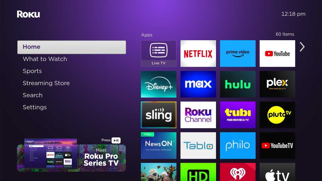
Navigating the Roku home screen has become increasingly complex with banner ads and extra menu options. While Roku still boasts a relatively simple streaming interface, its once-user-friendly app grid is now cluttered with redundant shortcuts and content tiles. This guide provides four easy steps to declutter your Roku home screen and restore some of its original simplicity.
Expanding the App Grid
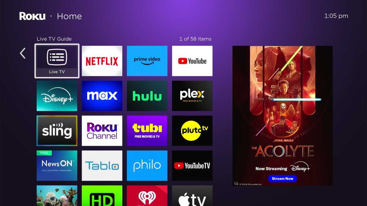
Roku’s traditional three-column app grid felt cramped, primarily due to the persistent banner ad on the right. Roku OS 12 introduced a four-column grid with smaller icons. While initially met with some resistance, this option significantly improves usability for most users.
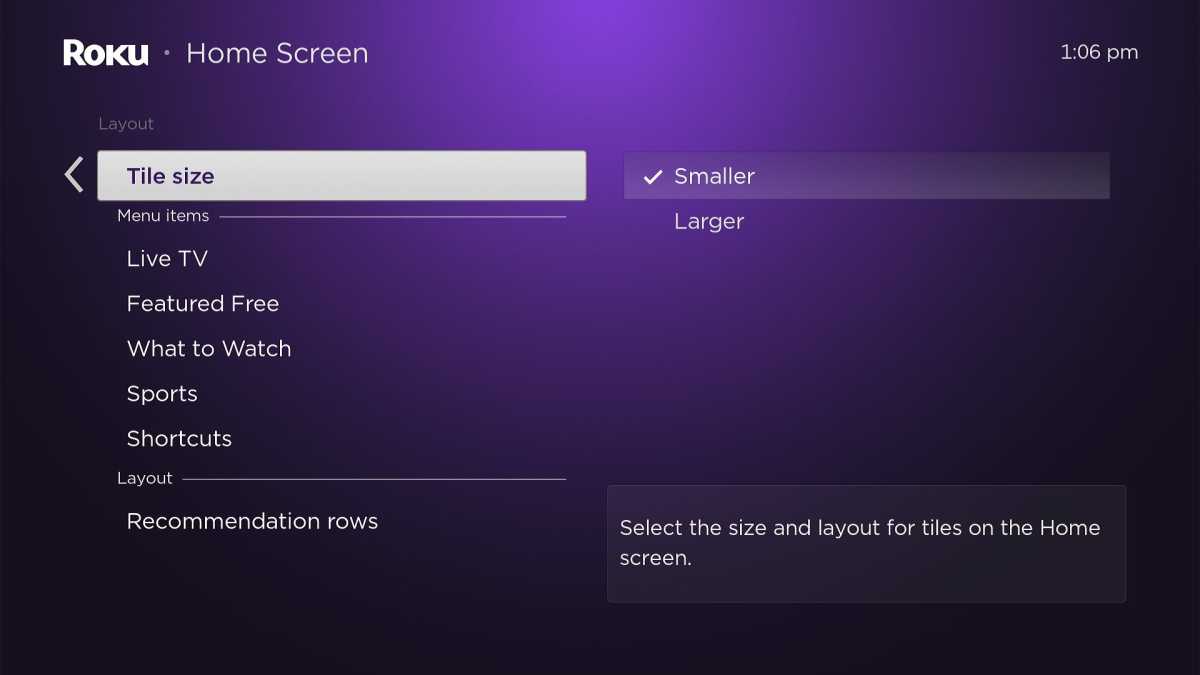
To enable this feature, go to Settings > Home Screen > Tile Size, and select “Smaller.” If the smaller icons are difficult to see, you can always revert to the larger size within the same menu.
Hiding the “What’s Streaming” Row
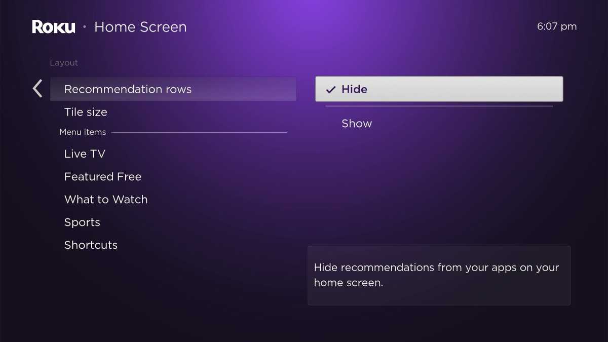
Roku recently added a “What’s Streaming” recommendation row at the top of the app grid. While a content-focused interface is appealing in theory, these recommendations often fall short. Limited to just three suggestions, their relevance is often low, and identifying their streaming source requires extra clicks. This row primarily serves as an unnecessary distraction.
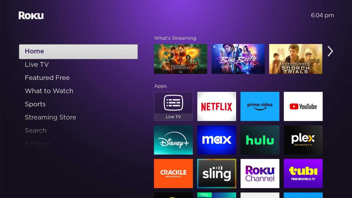
To remove this row, navigate to Settings > Home Screen > Recommendation Row and select “Hide.”
Removing Shortcuts
Roku’s “Shortcuts” section offers quick access to certain actions. However, these shortcuts often duplicate existing functionality. “Add channels” simply redirects to the Streaming Store, accessible via the sidebar. “TV Off” replicates the power button functionality on most Roku remotes. While the “Sleep Timer” shortcut on Roku TVs might be useful, most users can eliminate this section entirely.
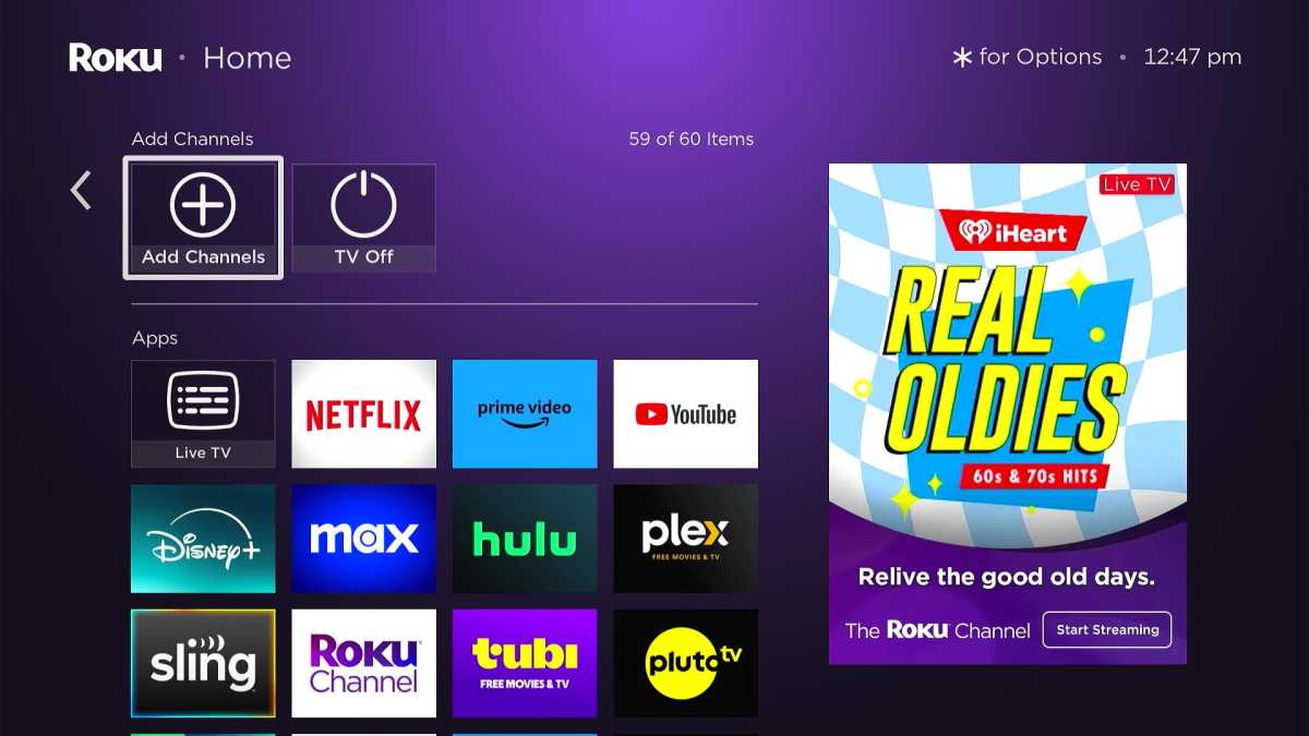
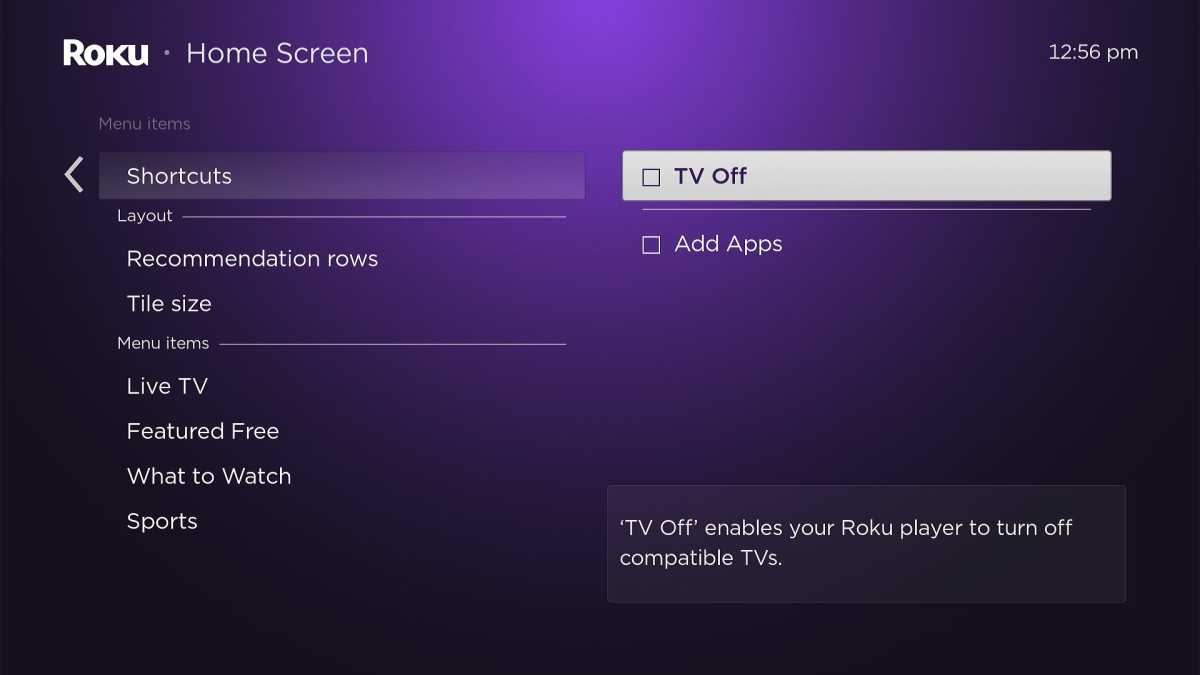
To remove shortcuts, go to Settings > Home Screen > Shortcuts and uncheck all options.
Streamlining the Sidebar
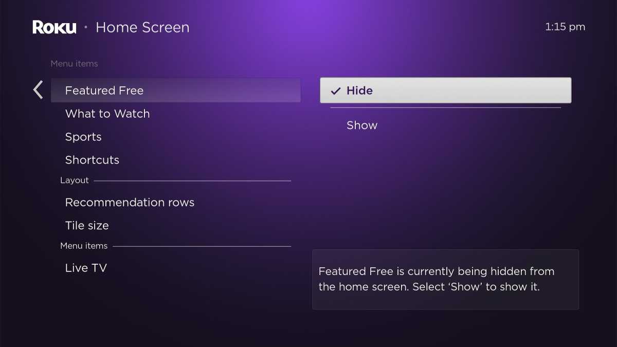
A new banner ad below the left sidebar reduces navigation space, potentially hiding menu items. While the ad itself can’t be removed, streamlining the sidebar can improve visibility. Hiding the “Live TV” and “Featured Free” tiles is recommended, as their functions are duplicated elsewhere in the interface. Live TV is accessible through the Home menu, and “Featured Free” content is often found within the “What to Watch” section.
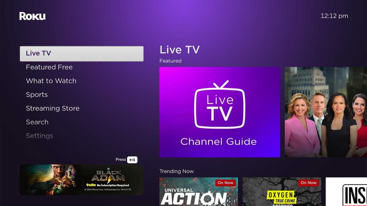
Navigate to Settings > Home Screen and under “Menu Items,” selectively hide “Live TV,” “Featured Free,” “What to Watch,” and “Sports” to maximize sidebar visibility. Even hiding a single section can make a noticeable difference.
By implementing these four simple steps, you can reclaim a cleaner and more user-friendly Roku home screen experience.


