Microsoft Excel is a powerful tool for data analysis, but spreadsheets filled with numbers can be daunting. Charts transform complex data into easily digestible visuals, significantly improving readability and comprehension. This guide provides a comprehensive walkthrough on how to create various chart types in Excel, empowering you to effectively communicate your data.
For those unfamiliar with data analysis, or even seasoned Excel users looking for a refresher, this guide will simplify the process of chart creation. From basic bar graphs to more complex 3D visualizations, you’ll learn how to leverage Excel’s charting capabilities to unlock the stories hidden within your data.
Inserting Your First Chart
Step 1: Data Entry: Begin by inputting your data into the spreadsheet, ensuring each column has a clear, descriptive header. The column headers will be used to label your chart axes and legends. If you need to rearrange or add columns later, Excel’s flexibility allows for easy adjustments.
Step 2: Data Selection: Highlight the cells containing the data you want to visualize. Accurate selection is crucial as it determines the information represented in your chart.
Step 3: Recommended Charts: Excel offers a range of pre-designed chart templates. Navigate to the Insert tab and click Recommended Charts. This feature intelligently suggests chart types based on your data selection. Choose a template that best suits your needs and click OK.
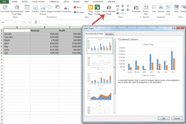 The Recommended Charts window in Excel for selecting a graph style. Image used with permission by copyright holder
Step 4: Chart Customization: Personalize your chart by double-clicking the Chart Title to edit it. Resize the chart by dragging its corners. Further customization options are available via icons adjacent to the chart:
- Plus-sign icon: Add or remove chart elements such as data labels, legends, and gridlines.
- Paintbrush icon: Modify the chart’s color scheme and style for visual appeal and branding consistency.
- Filter icon: Refine the data displayed in the chart, allowing for focused analysis of specific subsets.
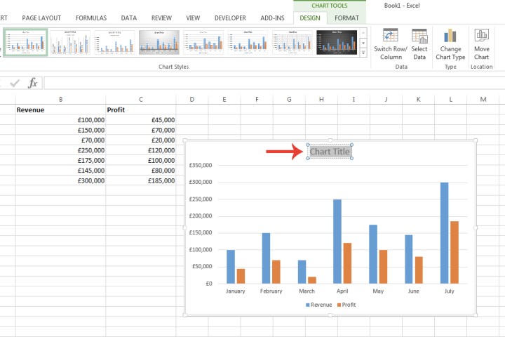 The customization options for a graph in Microsoft Excel. Image used with permission by copyright holder
Exploring Different Chart Types
Step 5: All Charts: For a comprehensive view of available chart types, click the All Charts tab within the Recommended Charts window. Explore categories like Bar, Line, Pie, Scatter, and more. Each category offers variations like 3D, clustered, and stacked, allowing you to tailor the visualization to your specific data and audience.
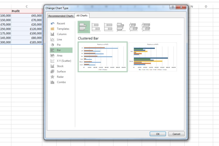 The All Charts window in Microsoft Excel. Image used with permission by copyright holder
Step 6: Changing Chart Type: To switch to a different chart type after initial creation, select the chart, navigate to the Chart Design tab (which appears when a chart is selected), and click Change Chart Type.
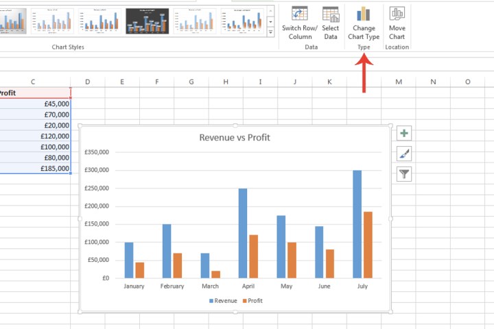 The Change Chart Type button in Microsoft Excel. Image used with permission by copyright holder
Step 7: Direct Chart Selection: Alternatively, you can select a chart type directly from the Insert tab. Click the dropdown arrow next to each chart icon for a preview of how your data will be visualized with that specific design. This allows you to quickly experiment with different chart types before committing to one.
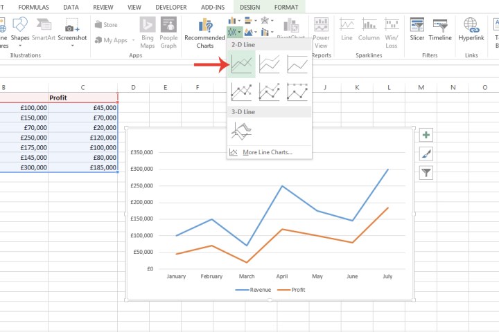 The drop-down menu for a specific graph type in Microsoft Excel. Image used with permission by copyright holder
Conclusion
Creating compelling charts in Excel is a straightforward process. By following these steps, you can transform your raw data into informative visuals, facilitating better understanding and communication. Whether you’re a student, professional, or anyone working with data, mastering Excel’s charting capabilities is a valuable skill for effective data presentation and analysis.


