Microsoft Excel reigns supreme as the spreadsheet application of choice for countless data analysts. While it handles simple spreadsheets with ease, its true power shines when dissecting and presenting complex data. This guide delves into creating and customizing pivot tables, unlocking one of Excel’s most potent tools.
Pivot tables provide dynamic perspectives on your data, enabling in-depth analysis and trend identification. Imagine evaluating sales results—you might want to analyze individual performance, product specifics, or sales within a particular timeframe. A pivot table consolidates your information, allowing effortless shifts in focus—a task otherwise tedious and time-consuming. This functionality is available across all current Excel versions, including Microsoft Office/365.
Step 1: Data Preparation
The foundation of a powerful pivot table lies in organized data. Utilizing Excel tables is highly recommended. This allows seamless integration of new rows upon refreshing your pivot table. At the minimum, maintain a tabular format with descriptive column headers and consistent data within each column. Consider adding supplementary columns if they enhance your pivot table’s analytical capabilities.
For instance, consider analyzing sales data with information on salespeople, products, regions, and varying prices. A sample table illustrates effective data organization for pivot table utilization. Creating this table involves entering data, selecting the entire range, and navigating to Insert > Table. While this step isn’t mandatory, it streamlines future data additions and pivot table updates.
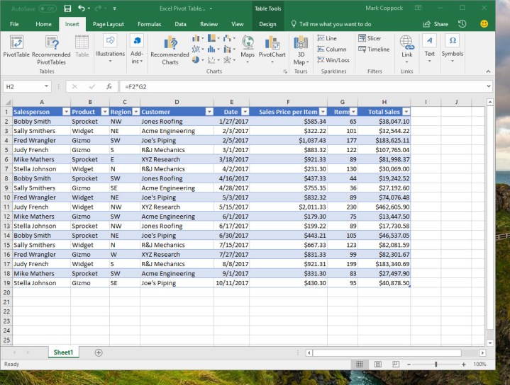 Sample Sales Data Table
Step 2: Leveraging Recommendations
Excel simplifies data analysis with its intuitive features. The Recommended PivotTables tool analyzes your data and suggests potential analytical approaches. Access this tool via Insert > Recommended PivotTables. In our example, Excel proposes several pivot tables, each exploring a different facet of the sales data. Note: Column headers are crucial. Excel interprets these headers to provide relevant recommendations. For accurate analyses, ensure clear and consistent labeling.
 Recommended Pivot Tables
Selecting a recommendation, like “Sum of Total Sales by Customer,” automatically generates the pivot table, displaying pertinent data. The right-hand PivotTable Fields dialog reveals the criteria used. We’ll explore these fields further in the customization section.
Step 3: Pivot Table Customization
The PivotTable Fields dialog box is your control center. The configuration cog allows personalized adjustments to the dialog’s appearance.
Fields Selection: Choose the columns relevant to your analysis. Excel intelligently determines whether a column becomes a pivot table header or contributes data within the table. Selecting “Items” adds the item count per customer, while selecting “Date” organizes sales by occurrence.
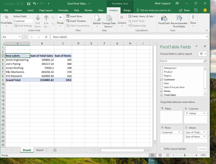 Fields Selection Example
 Date Field Example
Experiment with adding and removing fields to observe their impact. While Excel’s default selections are often insightful, manual adjustments offer further refinement.
Filters: Refine your data view by dragging fields into the “Filters” section. Dragging “Customer” allows filtering by specific customers.
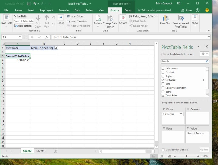 Filters Example
Columns: Expand reporting by dragging fields into “Columns.” Dragging “Date” might summarize sales by month, valuable for analyzing monthly performance and customer buying patterns.
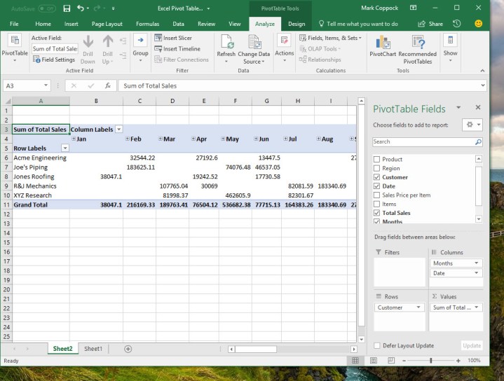 Columns Example
Rows: Embed data within rows by dragging fields into “Rows.” Dragging “Date” here might break down sales by customer per month, summarizing by customer rather than month. This highlights individual customer sales while revealing time-based trends.
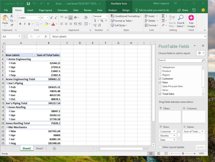 Rows Example
Values: The “Values” section determines your analysis type. Clicking the down arrow reveals various numerical calculations. Switching from “Sum” to “Average” displays average sales per customer and overall. This highlights customers performing above or below average.
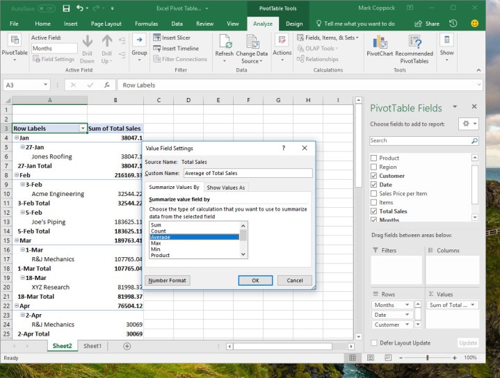 Values Example
Step 4: Creating Pivot Tables from Scratch
Once comfortable with pivot table functionalities, create them from scratch. Navigate to Insert > PivotTable, manually select your data (a table, range, or external source), and choose a new worksheet or a location on the existing one.
 Creating Pivot Table Dialog
You’ll then have a blank pivot table and the PivotTable Fields dialog box. Building your custom pivot table involves selecting fields, configuring calculations, and defining display preferences. To analyze salesperson performance per month with a yearly total, select “Salesperson,” “Date,” and “Total Sales,” drag “Salesperson” to “Filters,” and format values as currency. Excel intelligently handles date placement and summation.
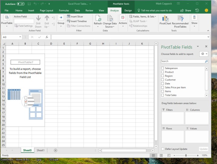 Blank Pivot Table
 Salesperson Performance Pivot Table
By default, Excel displays all data. Filter by a single salesperson for a focused view. This reveals individual sales patterns, potentially uncovering valuable insights for strategic decisions.
 Filtered Salesperson Data
Step 5: Further Learning Resources
For advanced pivot table mastery, explore Microsoft’s training resources and numerous third-party training options. This involves deeper dives into Excel’s data handling capabilities. Remember, a well-defined objective is key to effective pivot table utilization. With careful planning and data organization, pivot tables become invaluable tools for insightful data analysis.


