Creating compelling PowerPoint presentations is crucial for conveying your message effectively, whether to executives, clients, or colleagues. A poorly designed slideshow can hinder your presentation’s impact. This guide outlines best practices for crafting impactful and engaging PowerPoint presentations.
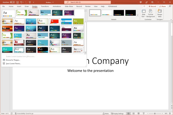 Theme collection in PowerPoint.Image: PowerPoint’s Theme Collection offers diverse design options.
Font Selection: Prioritizing Readability
While stylish fonts can be tempting, readability should be paramount. Your audience needs to effortlessly grasp headings and bullet points. Two primary font styles exist: serif and sans serif.
Serif fonts, like Times New Roman and Garamond, possess decorative strokes and a classic feel, often used in print. Sans serif fonts, like Arial and Calibri, are clean and modern, commonly used digitally.
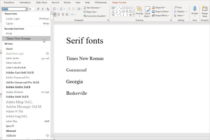 List of serif fonts in PowerPoint.Image: Examples of serif fonts available in PowerPoint.
Serif fonts can appear blurry on screens due to their strokes, making sans serif the preferred choice for digital presentations. Maintain consistency by using the same font style (serif or sans serif) throughout your slideshow.
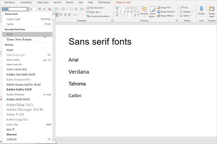 List of sans serif fonts in PowerPoint.Image: Examples of sans serif fonts available in PowerPoint.
Color Palette: Enhancing Visual Appeal
Color choice significantly impacts your presentation’s effectiveness. Well-chosen colors enhance, while clashing colors distract. Avoid combinations like red and blue or red and green, which can strain eyes and pose challenges for colorblind individuals.
Warm colors (reds, oranges, yellows) are attention-grabbing, while cool colors (blues, greens, purples) are less so. Lighter colors generally stand out more than dark ones.
PowerPoint’s built-in themes offer pre-designed color schemes. Access these via the Design tab. Within each theme, Variants provide different color palettes and font styles.
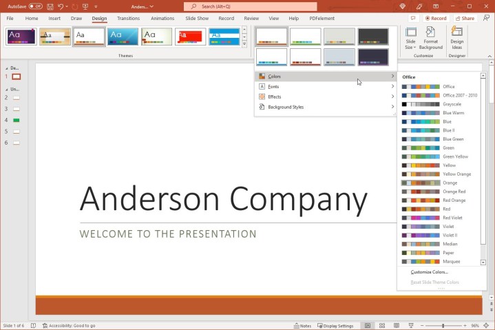 Color schemes for a theme in PowerPoint.Image: Explore various color schemes within a chosen theme.
Animations and Effects: Less is More
Animations can enhance engagement but overuse can be detrimental. Consider your audience and presentation’s purpose. Animations might suit a classroom setting but appear unprofessional for executive presentations. Use animations subtly and purposefully, such as revealing bullet points one by one on click. This keeps the audience focused on your current point.
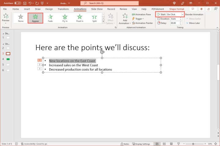 Animations tab showing the Appear effect and On Click for Start.Image: Setting up an “Appear” animation triggered “On Click.”
Use embedded videos sparingly and only when directly relevant to your message.
Presentation Rules: Keeping it Concise
Several presentation rules emphasize simplicity: the 10/20/30 rule (10 slides, 20 minutes, 30-point font), the five-by-five rule (5 words per line, 5 lines per slide), the 5/5/5 rule (adding a limit of five consecutive text-heavy slides), and the seven-by-seven rule (7 words per line, 7 lines per slide).
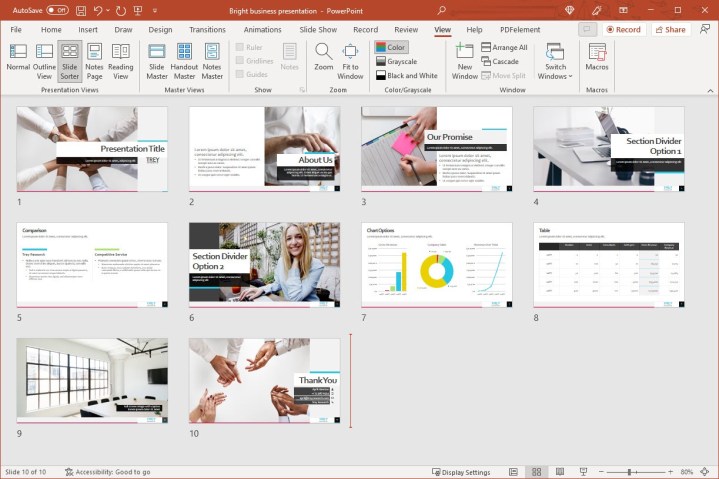 Slide sorter view in PowerPoint showing 10 slides.Image: Overview of slides in Slide Sorter view.
These rules encourage concise presentations and visually driven slides. Minimize text to keep your audience engaged visually rather than reading extensively.
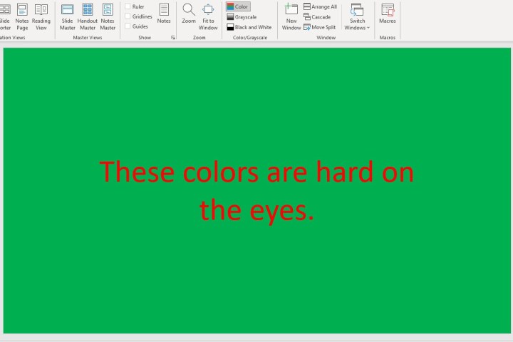 Red text on green slide in PowerPoint.Image: Example of poor color contrast – red text on a green background.
Conclusion: Crafting Memorable Presentations
By following these best practices, you can create impactful and memorable PowerPoint presentations. Focus on clear communication, visual appeal, and concise delivery to effectively engage your audience. For further enhancement, explore adding audio or music to your slides. Remember, a well-crafted presentation strengthens your message and leaves a lasting impression.


