Android receives a plethora of new features annually from Google. However, significant visual overhauls are less frequent, occurring every few years. The last major redesign coincided with Android 12 over three years ago. Now, on the cusp of Android 16’s release, Google is poised to introduce another aesthetic transformation, sparking excitement and anticipation. While the changes appear promising, the timing raises concerns.
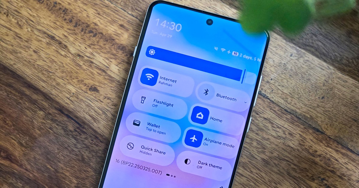
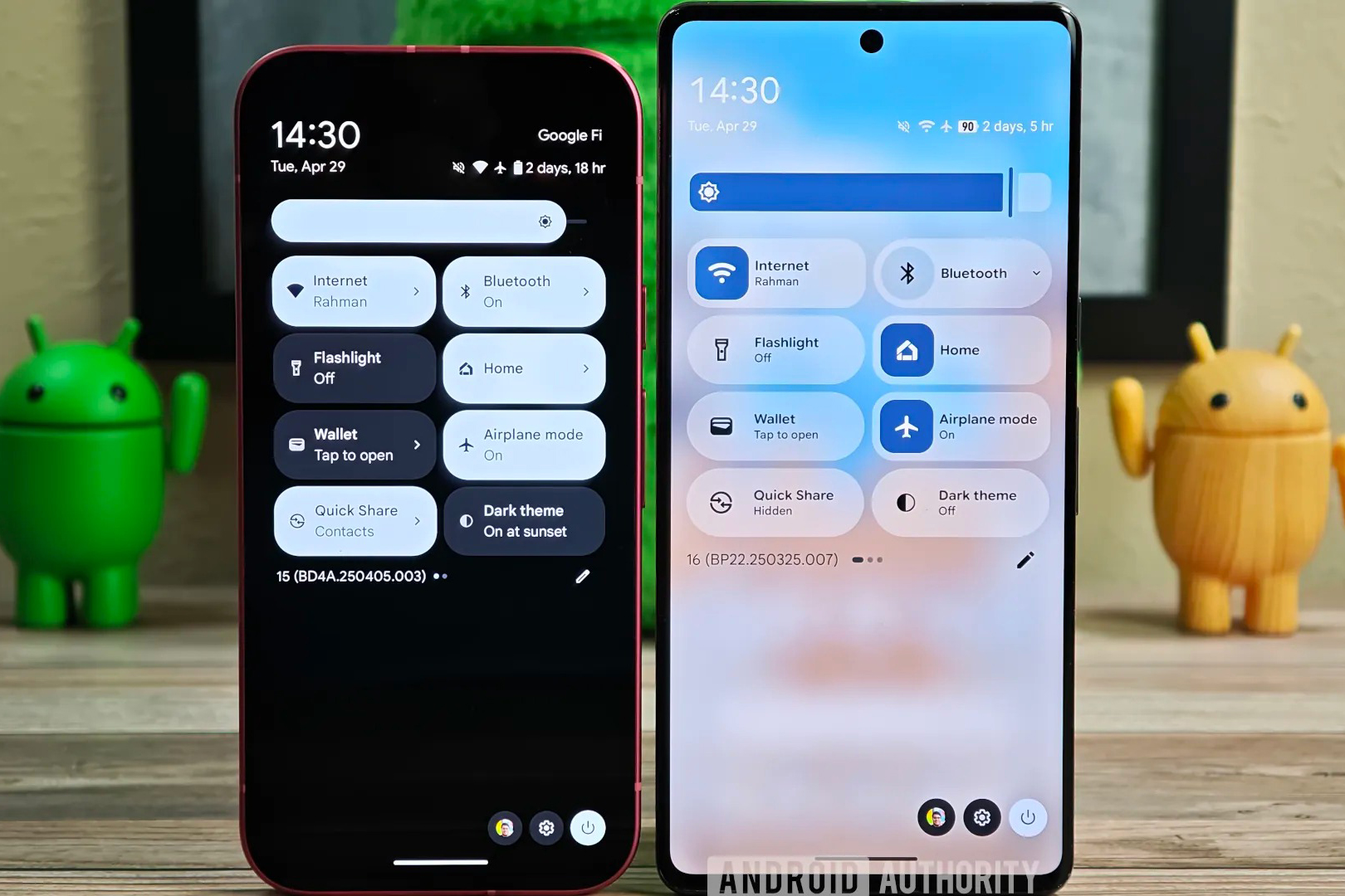
The leaked redesign showcases a revitalized interface with vibrant colors and modernized sliders. Even subtle details like status bar icons have been refined, exhibiting greater detail. A prevalent translucent aesthetic contributes to a contemporary feel. The visual improvements are undeniable, but the timing of their unveiling seems peculiar.
The upcoming Android 16 is slated for a formal rollout at Google I/O, commencing on May 20th. This naturally leads to speculation that the redesign will be announced alongside other major Android updates. However, several factors suggest otherwise.
First, the redesign wasn’t discovered as a broadly available feature. Instead, Android Authority uncovered it within the latest Android 16 beta by reverse-engineering the code. This implies limited access, even for those currently testing the beta. Whether the redesign will be included in the stable Android 16 release remains uncertain.
Is This Preview Premature?
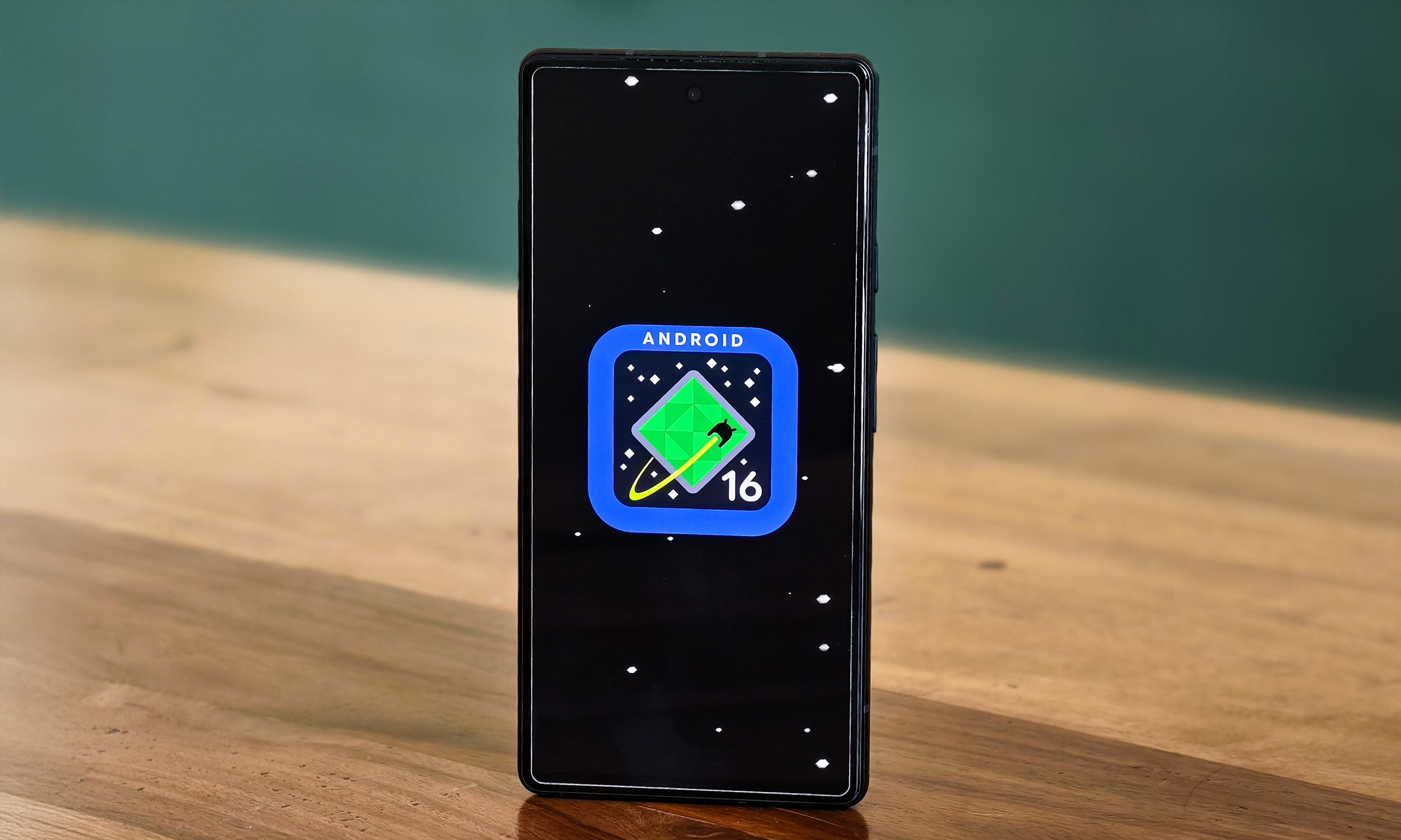
Historically, significant visual or feature overhauls align with new Android versions. Major upgrades warrant dedicated version number updates, a practice consistent across the software industry. Apple, for example, is anticipated to refresh its interface across iOS, macOS, and tvOS with a unified, glass-inspired theme.
Software companies typically preview interface changes months in advance during beta testing. This allows users to acclimate to potential workflow disruptions and provides developers with valuable feedback opportunities. Google often adopts this approach, offering optional features rather than forcing changes upon users. Adaptive icons, introduced in Android 12, exemplify this gradual implementation.
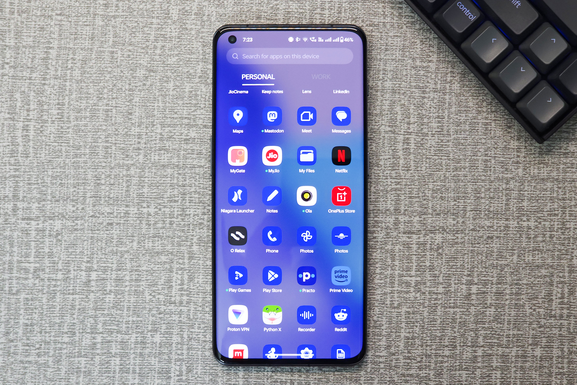
Considering this precedent, it seems unlikely the redesign will be part of Android 16. It’s more plausible that these changes lay the foundation for a broader visual update in Android 17. Google’s compressed development timeline for Android 16, following a delayed Android 15 launch, further supports this theory.
Releasing a feature with minimal testing and limited user feedback would be premature. A more probable scenario is a Pixel 10 exclusive launch later this year. However, Google hasn’t historically differentiated devices based on visuals, and such a move could challenge Android’s open-source nature.
The Future Remains Unclear
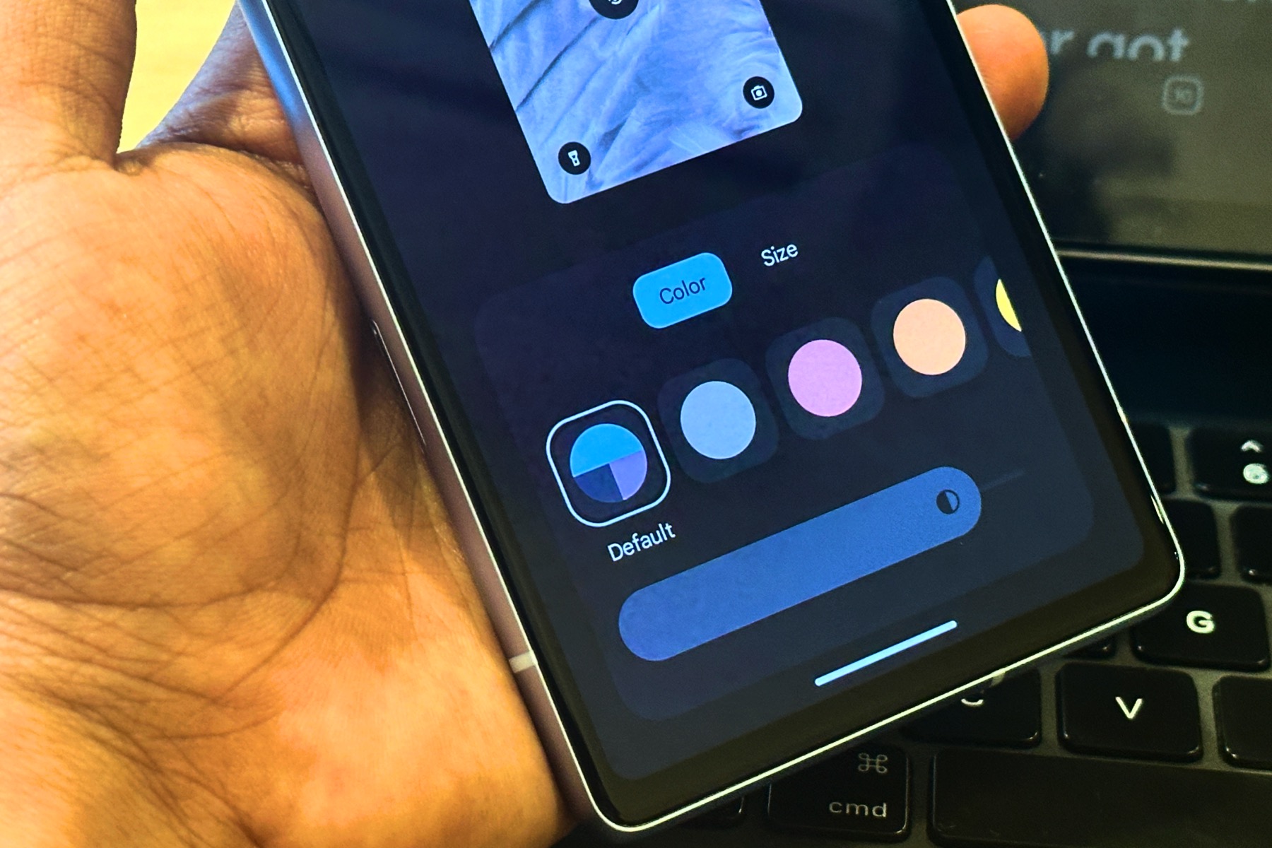
Despite the evidence, Google might still surprise us. They are developing a third iteration of Material Design, reportedly dubbed “Expressive.” Android Authority suggests Google will introduce this concept at I/O, encouraging developer adoption.
Unlike Apple’s strict iOS design guidelines, Google offers more flexibility. This could result in fragmented adoption across Android versions. However, for elements under Google’s direct control, like the Settings menu, Quick Settings, and notifications, the new interface might arrive sooner as an optional theme. Whether this occurs at I/O, alongside the Pixel 10 launch, or with the Android 17 beta remains uncertain.
A Long-Awaited Refresh
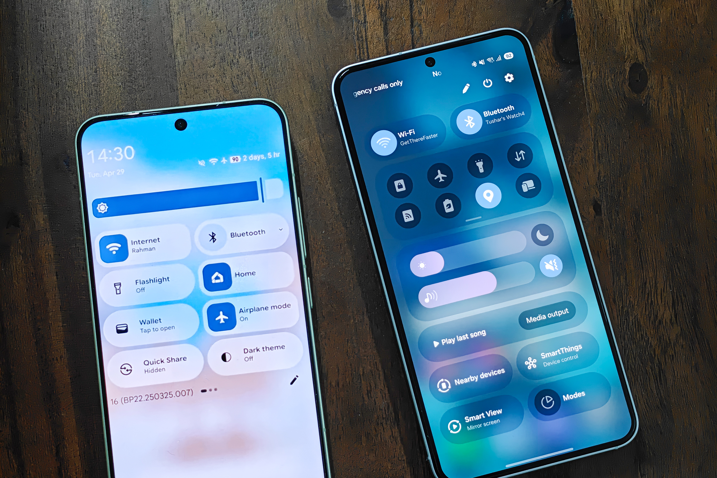
Regardless of the rollout strategy, the redesigned interface appears sleek and modern. Its arrival is long overdue. Compared to other Android manufacturers, stock Android’s opaque elements appear dated. By adopting this aesthetic, Android would align with the visual language of iOS and other Android skins like Samsung’s One UI, Xiaomi’s MIUI, and OnePlus’s OxygenOS, which already embrace translucent backgrounds and simplified icons.
Extending the release provides Google with ample testing and refinement time, allowing third-party developers to integrate similar features. Hopefully, Google avoids repeating past patterns of abandoning projects like Adaptive icons or Desktop mode.

