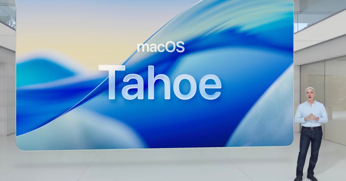
Apple’s dedication to aesthetic innovation is a cornerstone of its identity. At the anticipated WWDC 2025, the company is poised to unveil a new design direction heavily influenced by glass elements. This “glassmorphism” trend, characterized by transparency and reflections, is expected to permeate app icons, windows, and widgets across iPhone, iPad, and Mac interfaces, heralding a significant Apple glassmorphism design evolution for iOS 26 and its ecosystem counterparts.
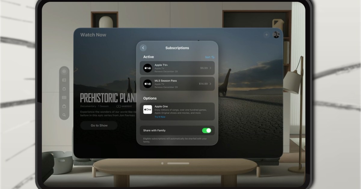
Sebastiaan de With, a former Apple designer and creator of apps like Kino and Halide, has humorously suggested that the term “glassmorphism” might become ubiquitous post-WWDC. Beyond the buzzword, the core idea revolves around qualities like fluidity and simplicity, echoing Steve Jobs’ philosophy: “Simplicity is the ultimate sophistication,” as he shared with biographer Walter Isaacson. Apple has already offered a preview of this unified design language with visionOS, the operating system for its Vision Pro headset. However, the widespread adoption of glassmorphism on mainstream devices won’t be an entirely new venture.
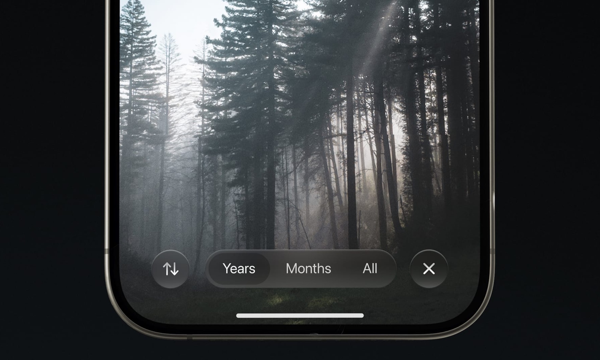 Conceptual render of iOS 26 showcasing the rumored glassmorphism interface elements on an iPhone.
What Exactly is Glassmorphism?
At its core, glassmorphism is a visual design style drawing inspiration from the properties of glass, particularly its transparency, edge reflections, and ability to convey depth. When applied to digital interfaces like apps and windows, this translates into translucent UI elements and subtle bokeh effects, creating a layered, dimensional feel.
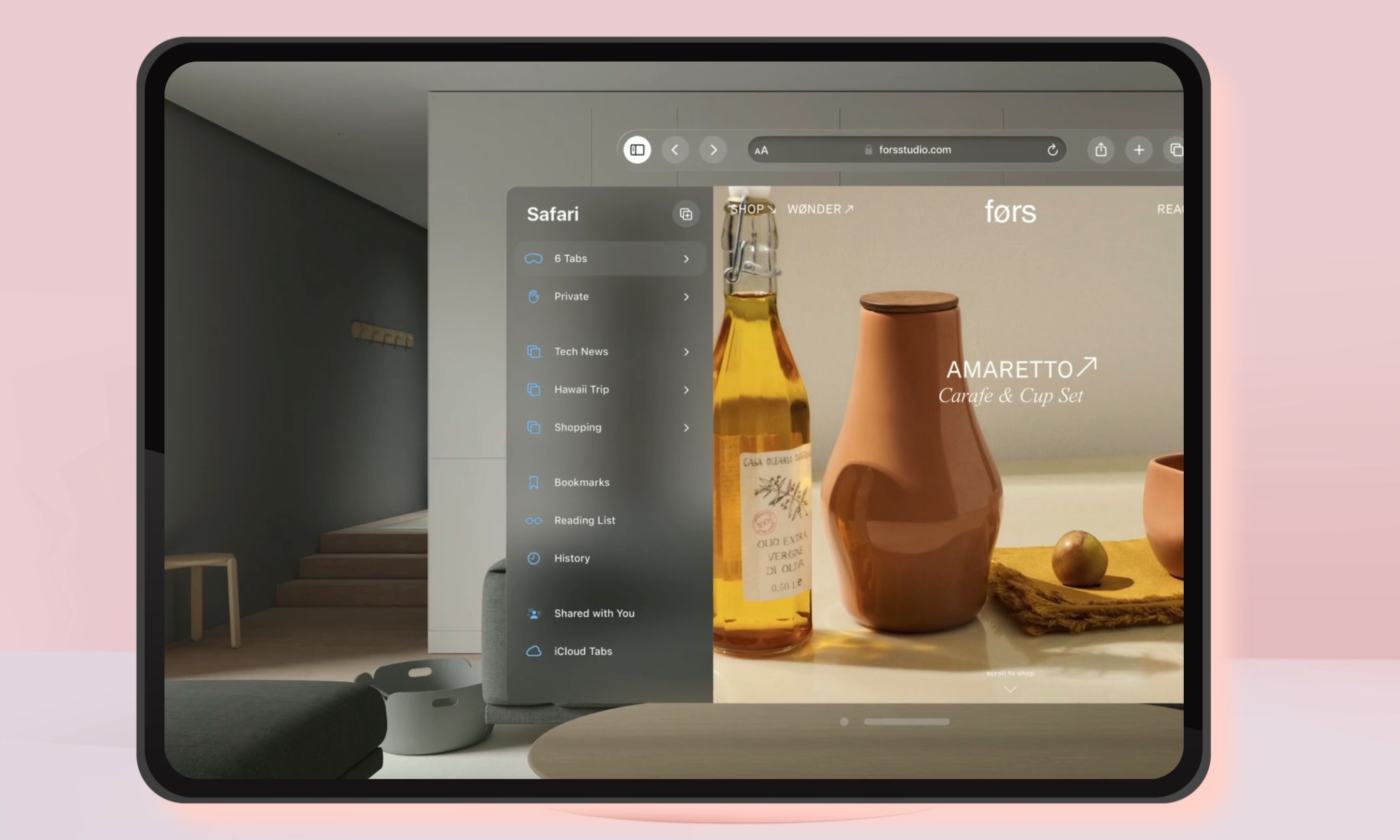 Concept art illustrating iPadOS 26 menu options with a frosted glass effect.
Apple’s implementation across iOS 26, macOS 26, iPadOS 26, and watchOS 26 is reportedly termed “Liquid Glass.” According to Bloomberg, these new interface elements will feature the sheen and see-through visuals characteristic of a glassy surface. The goal is to transition from a flat, 2D aesthetic to one that evokes 3D depth. The Interaction Design Foundation describes it as “design elements look layered—with objects floating in space—and the top layer seems like a piece of virtual glass.”
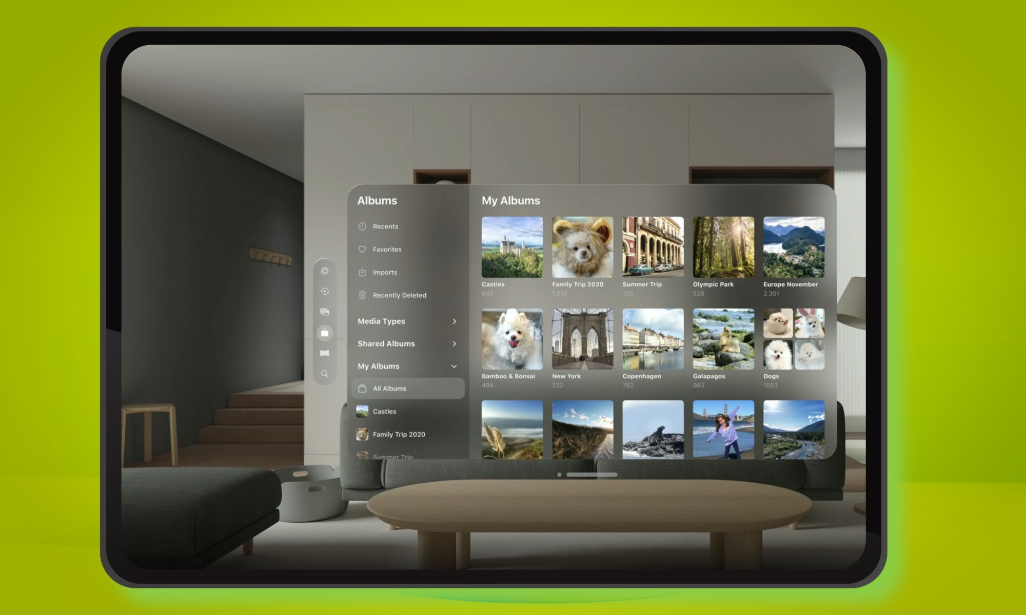 Finder window concept on iPadOS 26 displaying the layered glassmorphism design.
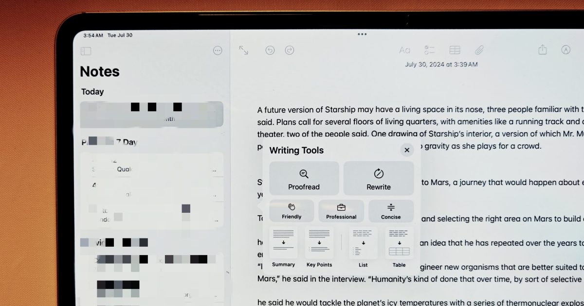
To achieve this glass-inspired look in software, designers typically use blurred backgrounds set against vivid colors, with outlines rendered in a translucent style. It’s about simulating a frosted glass effect by placing foreground elements over a blurred, often gradient, backdrop with contrasting colors. Light borders and subtle shadows enhance the depth and visual effects of glass, complemented by extensive use of layering. Apple’s own design guidelines allude to this glass-inspired ideology, with detailed video walkthroughs available.
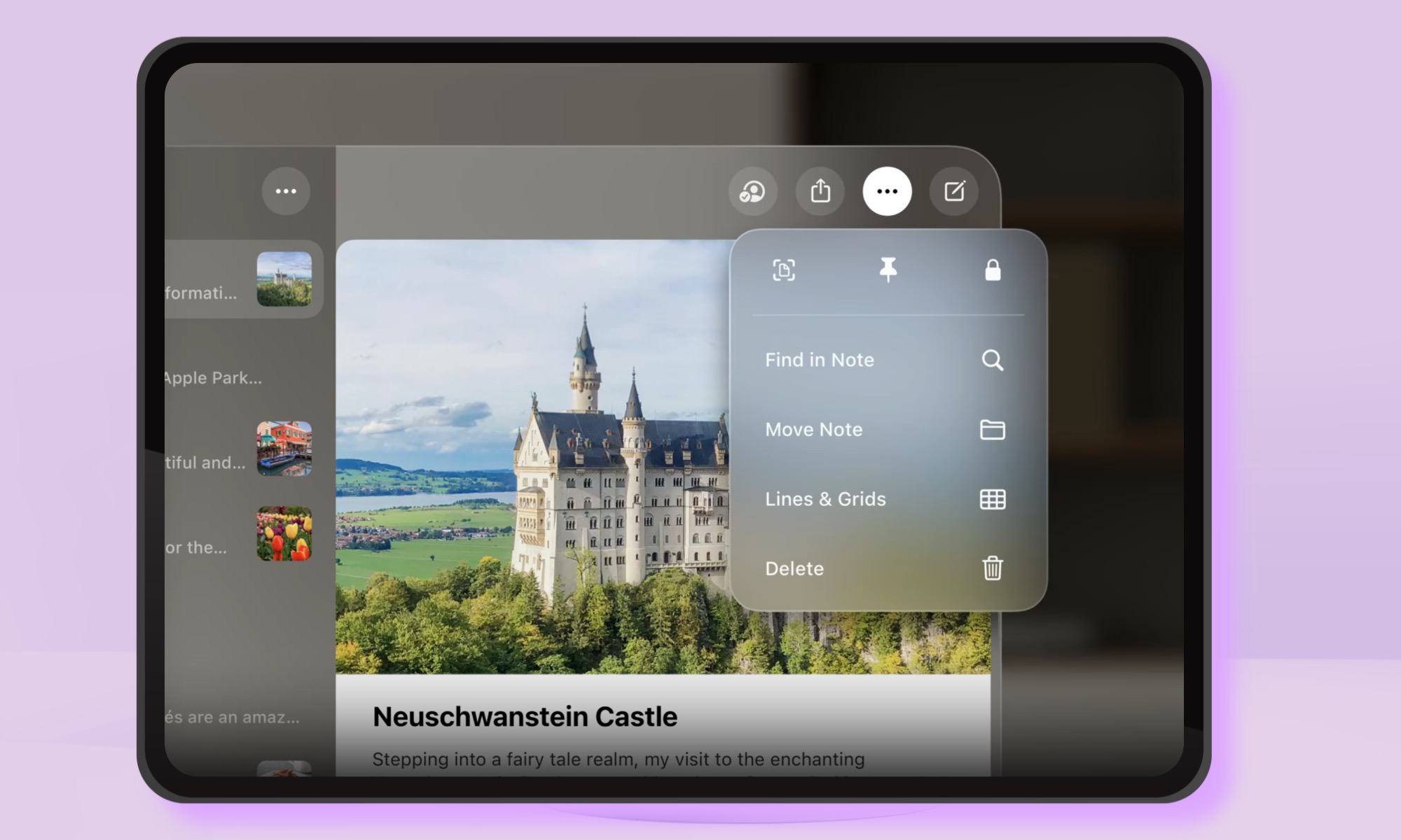 iPadOS 26 media controls concept showcasing translucent glassmorphism elements.
“The default window style consists of an upright plane that uses an unmodifiable background material called glass and includes a close button, window bar, and resize controls that let people close, move, and resize the window,” Apple states.
Not an Entirely New Concept
Apple is no stranger to glassmorphism. The company began integrating such elements with macOS Big Sur in 2020, introducing gradient minimalism with blurred background effects for app windows. Design experts often refer to this as “frosted glass aesthetics,” and it persists today.
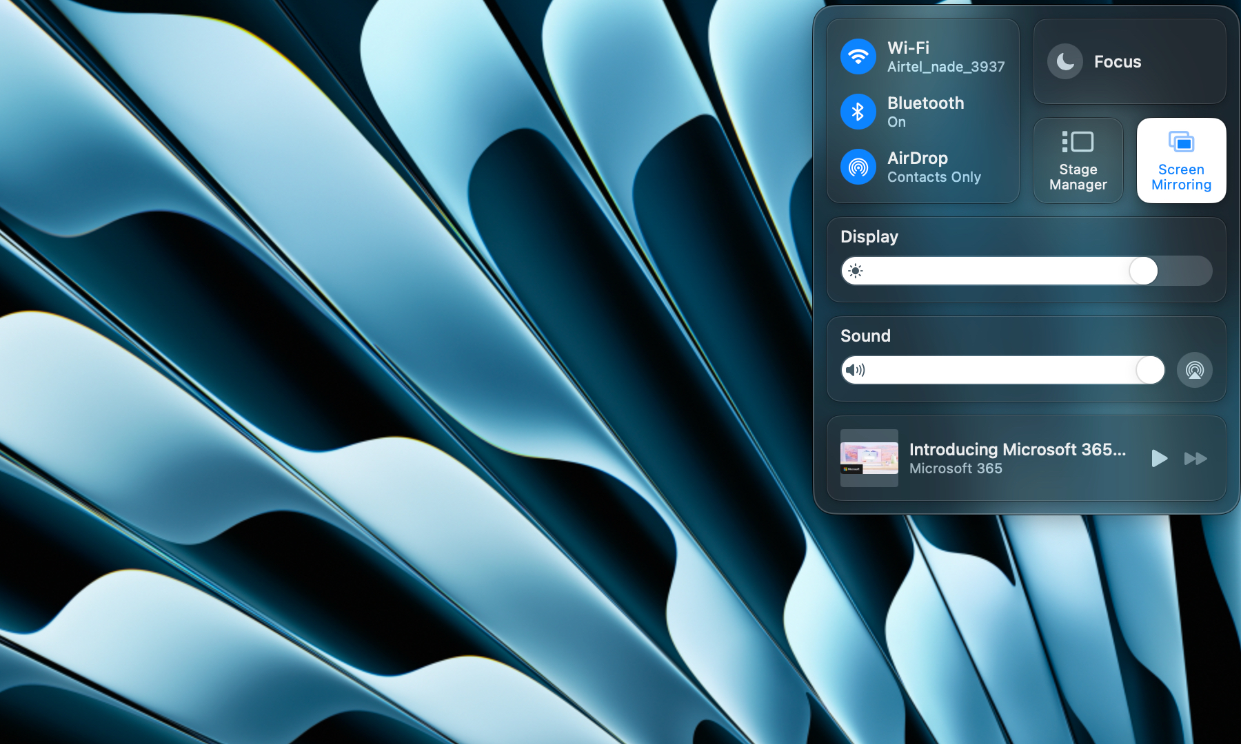 macOS Sequoia Control Center demonstrating existing frosted glass UI elements.
Elements of this design are already visible in the Control Center of macOS Sequoia and when opening app folders in iPadOS.
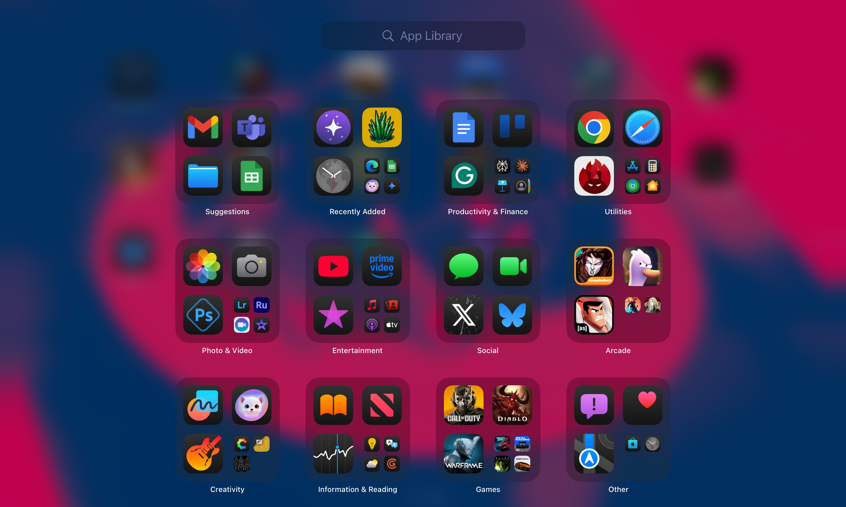 Translucent app folders in iPadOS 18 exhibiting early glassmorphic design cues.
In fact, Apple first experimented with this design language in iOS 7 before shifting towards the flatter, solid-color design prevalent on current iPhones and Macs.
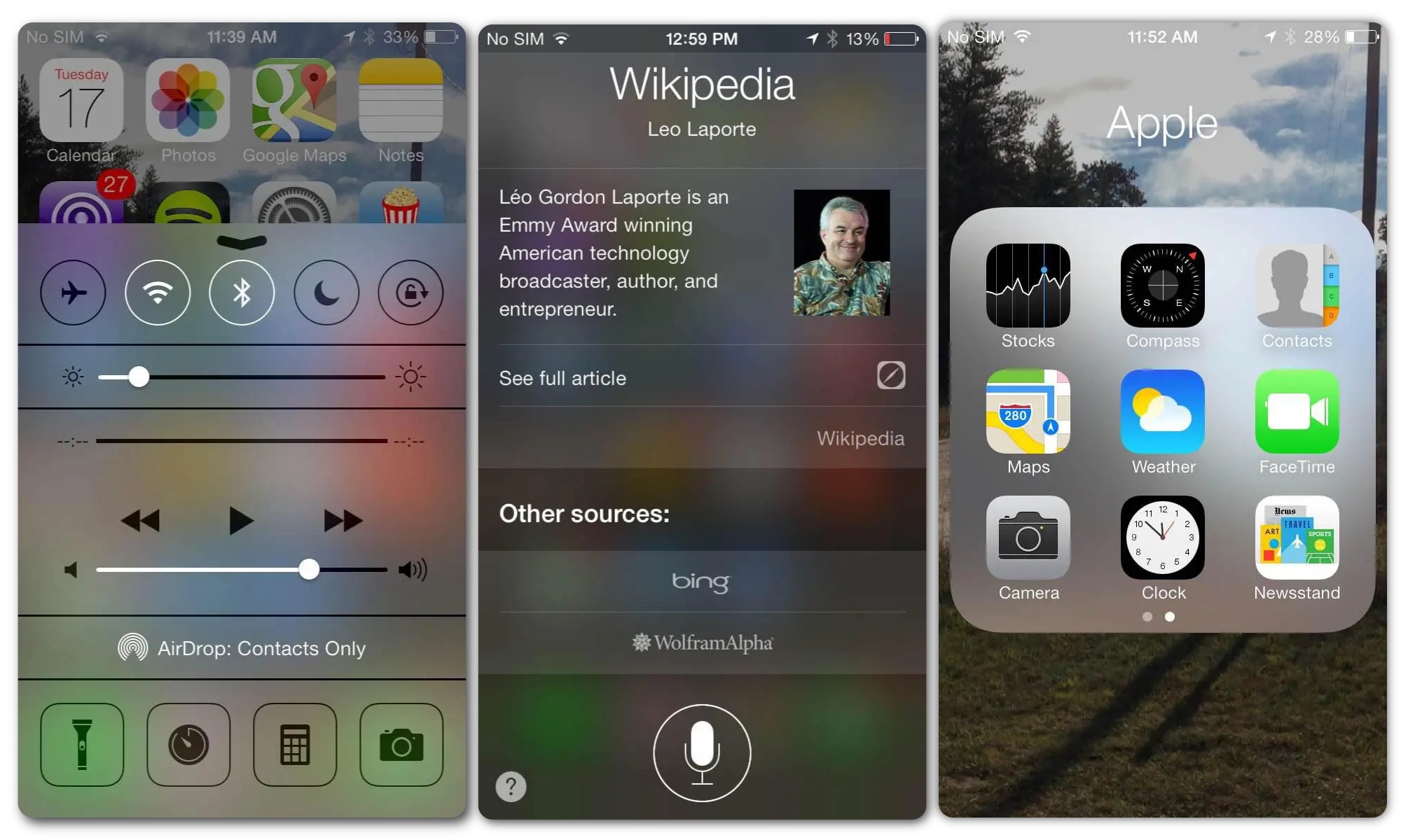 Screenshot of iOS 7 interface highlighting its early transparent design elements.
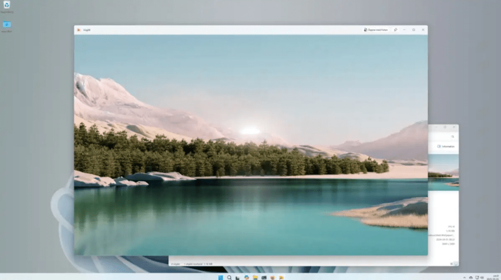
Apple isn’t the sole proponent of glass-inspired UI. Microsoft introduced its Fluent Design system with Windows 10, incorporating glassmorphic elements in the Start Menu and other areas. This balanced semi-transparent backgrounds with light shadows and sharp borders. Microsoft’s initial foray into this design language was the Aero Glass theme in Windows Vista, nearly two decades ago, which aimed for a frosted glass effect, particularly noticeable in the taskbar and Media Player controls. You can delve into Microsoft’s archived developer guide here.
Microsoft also showcased a compelling vision of a glassmorphic computer interface in a concept video, though it hasn’t materialized on Windows machines.
Watch the Microsoft Design concept video on YouTube
Why Implement This Now?
While the exact appearance of the updated design language for iOS, macOS, watchOS, and tvOS remains under wraps, rumors point to a VisionOS-inspired makeover. Bloomberg suggests Apple aims to unify the design language across all its products. “That will include transparency and shine effects in all of Apple’s tool bars, in-app interfaces and controls,” the report notes.
However, this isn’t the sole objective. Apple is reportedly timing this design overhaul to coincide with the highly anticipated 20th-anniversary iPhone.
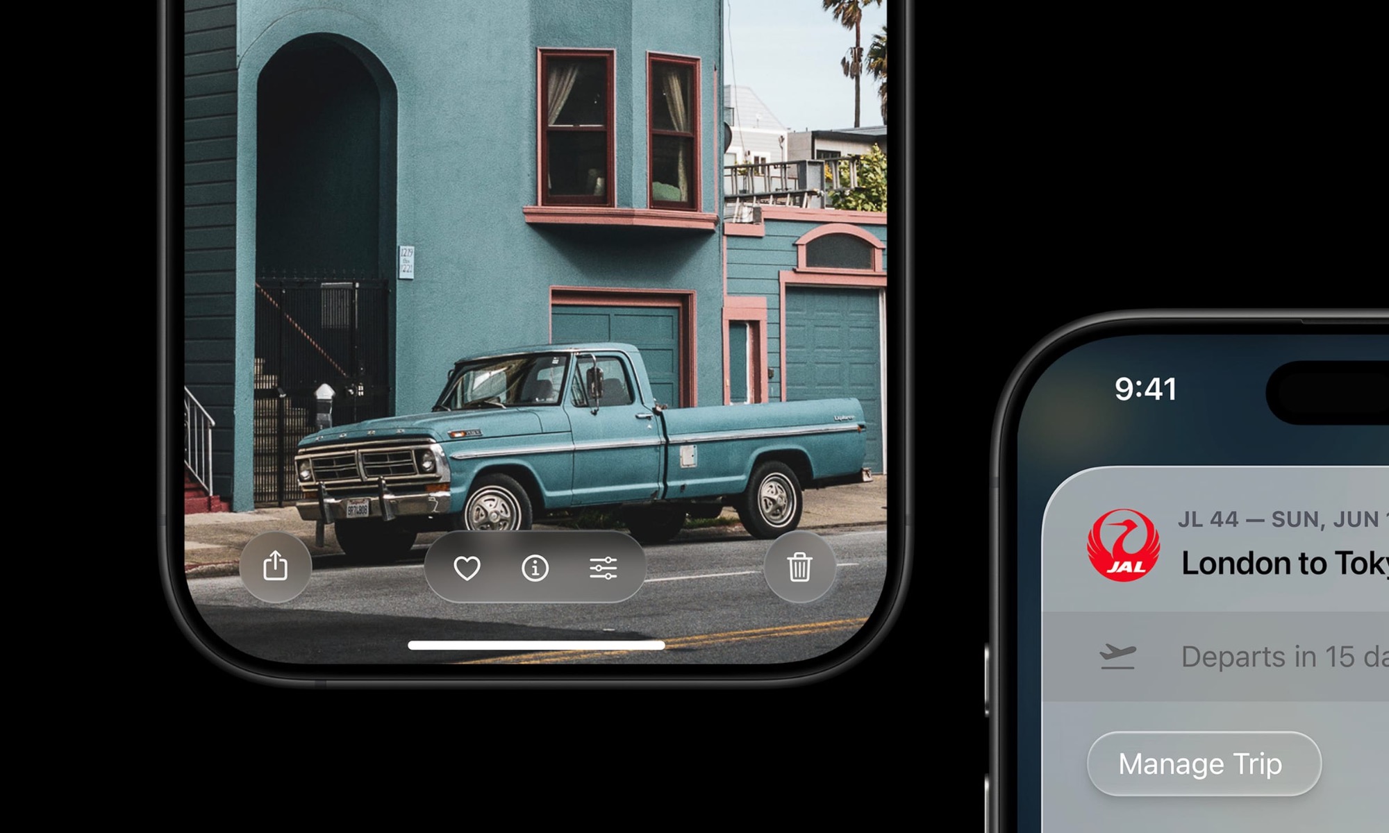 Conceptual render illustrating the comprehensive iOS 26 redesign with glassmorphism.
This landmark device is rumored to feature curved glass aesthetics and a seamless screen, eliminating cutouts for Face ID and the selfie camera. This evolution is anticipated to be as significant as the iPhone X, which abandoned thick bezels and the physical Touch ID home button for an all-screen design, prompting corresponding UI and gesture adjustments in iOS. More details about the upcoming iOS 26 overhaul are expected imminently.
In conclusion, Apple’s rumored adoption of “glassmorphism” or “Liquid Glass” for iOS 26 and its other operating systems signifies a strategic move towards a more unified, three-dimensional, and aesthetically rich user experience. While drawing from past experiments and broader industry trends, this redesign appears intricately linked to future hardware, particularly the 20th-anniversary iPhone. As WWDC 2025 approaches, the tech world eagerly awaits the official unveiling of this new chapter in Apple’s design story.
